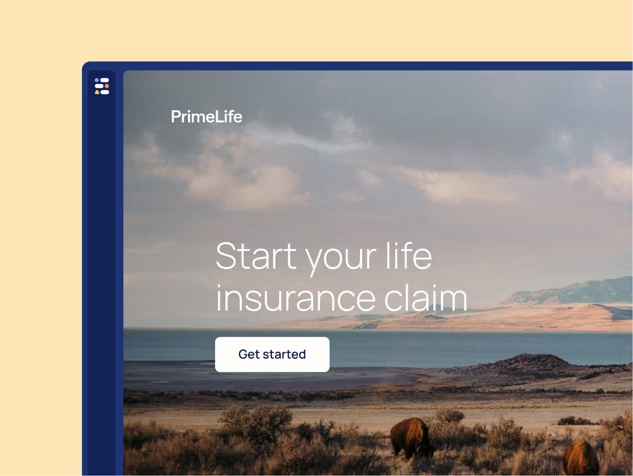
There are many insurance companies out there vying for attention from potential customers. Some of them have a very good user experience on their websites, while others could use some improvement.
What makes for a good user experience on an insurance company website?
Here are 11 tips from EasySend’s team to help improve the UX/UI of your insurance website and make it stand out from the rest!
1. Use clear and concise language
When it comes to insurance, there is a lot of technical jargon involved. However, your website should be geared toward the average person who may not be familiar with all the terminology. Use clear and concise language that everyone can understand.
One example of an insurer that does this well is Heaven Life. They use straightforward and everyday language to explain complex concepts in a way that everyone can understand.

2. Balance self-service and support
Ensure that your customers can complete actions such as getting a quote, updating their policy, or filing a claim digitally, but make support readily available at their fingertips in case they get in trouble.
Below is an example of Geico, which offers online self-service, but makes the contact us option easily available 24/7 via their app, online, or by phone.

3. Create dedicated areas on the website for different lines and customers
Your website should be easy to navigate so that users can find what they're looking for quickly and easily. Use a simple navigation bar with clear labeling, and consider using drop-down menus to keep the clutter to a minimum.
One way to improve navigation is to separate the website into sections depending on the type of customer. One example is Lincoln financial which has separate areas on its website for individuals, employers, and professionals, all with customized content and offers. This is a great strategy for insurers who serve more than one type of customer.

4. Make error messages actionable
Error messages must be clear and lead the customer to the next action. If services are unavailable in their area, let them know and provide alternative options. If their session has timed out, tell them how to sign back in. Don’t just leave them with a vague message like “Oops, something went wrong.”
Provide a clear action that they can take, either fixing the error or signing up for email updates.

5. Make it easy to get a quote
One of the main reasons people visit insurance company websites is to get a quote. Make it easy for users to get a quote by prominently displaying a “Get a Quote” button on your website.
A good way to measure if you are getting that right is to calculate the number of clicks the customer needs to make in order to get the quote after landing on your website. A quote should be available within a single click!

6. Include an online premiums calculator
An online calculator can be a helpful tool for users who want to compare different insurance policies. Make sure the calculator is easy to find and use, and include an easy option to enroll in the plan

7. Ditch PDF forms in favor of digital customer data intake methods
PDFs are not very user-friendly, especially on mobile devices. Still, many insurers require their customers to download those forms and then either upload them to the customer portal or send them via email back to the insurer.
Offer an easy way for customers to submit their informationThe best way is to build a seamless claims process that can be completed digitally from start to finish, including document uploads, signatures, and ID verifications.
The key is digital completion: the customer should be able to complete the entire process without leaving the digital channel.

8. Break complex forms into steps
Many processes in insurance require gathering a lot of information from the prospect or customer, including personal information, supplemental documentation, signatures et cetera. This can often become overwhelming.
The best way is to streamline and simplify complex processes by breaking them into small manageable steps. Make sure you let the customer know how long the entire process will take, and what documents and information they need to prepare ahead of time before they begin. Update your customers about their progress and how far along from completion they are, and of course, allow them to exit and continue later without losing their data.

9. Personalize workflows
Set up conditions to only show relevant questions and information to the customer. For example, if someone wants to get life insurance and you are asking the questions about the dependents, don't ask for the spouse's name if a person previously indicated that they aren't married.

10. Offer a save and continue later option
Some processes such as new insurance policy onboarding or claims can be time-consuming, and sometimes customers aren't able to complete the process in one sitting. They might be missing the necessary documentation or simply not have time to complete the process all at once. Offer save and continue later option, and don't forget to set up email or SMS reminders so that customer gets a gentle budget to complete the process once they started it.

11. Offer co-browsing
One way to simplify filling in complex forms is to offer co-browsing with a representative who can assist your customers in real-time. Co-browsing is a way to share a browser window so that both the customer and the representative can see what's on the screen and fill in the form together.
Co-browsing (also known as “co-watching”, “collaborative browsing”, and “side-by-side browsing”) is a service where a user can give others access to their screen in real time, as they are navigating an application or a website.
Co-browsing is a great way to provide a personalized and human touch to the digital customer experience, and is often utilized to create seamless delivery that closely resembles an in-person experience.

These are just some tips to improve the user experience of your insurance website. If you would like to learn more about how to transform customer data intake into a digital experience with EasySend, contact us today.


